Skip to content

Conversation

@fernandojsg
Copy link
Member

  • Removed the three dots and the contextmenu on the component's name and replace them by icons (Style and image to-be-defined)
  • Added confirmation while trying to remove or reset a component.
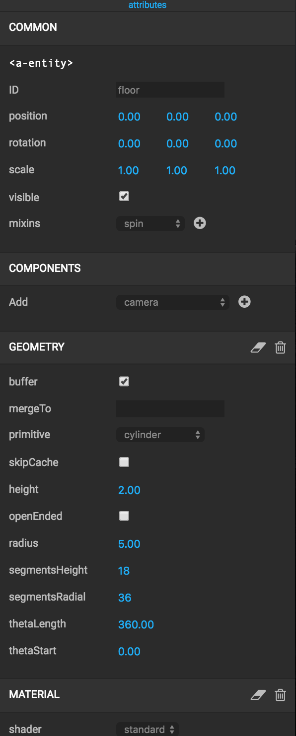
screenshot 2016-07-10 15 18 50

@dmarcos
Copy link
Member

dmarcos commented Jul 11, 2016

Where is the icon to copy the component to clipboard going to be?

@fernandojsg
Copy link
Member Author

@dmarcos next to the current icons, in the same row

@dmarcos
Copy link
Member

dmarcos commented Jul 11, 2016

Are we adding the icon on a different PR or should be part of this one?

@fernandojsg
Copy link
Member Author

Not yet, the icons will be something like the one used on the Copy to clipboard for entity (#188) and it will be added in another PR, not to mix different issues in the same PR (delete dots -> icons, and copy to clipboard)

@dmarcos
Copy link
Member

dmarcos commented Jul 11, 2016

Can we try labels instead of icons as @cvan suggested? It might not be too bad.

@fernandojsg
Copy link
Member Author

My idea is, as they all looks the same style, review the functionality and the placement and if we're good to go merge them and create another issue with "Style the component's icons"

@fernandojsg
Copy link
Member Author

do you mean label when mouseOver or label all the time?

@dmarcos
Copy link
Member

dmarcos commented Jul 11, 2016

Label all the time: copy, reset, remove instead of the icon.

@dmarcos
Copy link
Member

dmarcos commented Jul 11, 2016

We can add a subtle background to indicate it's a button

@fernandojsg
Copy link
Member Author

fernandojsg commented Jul 11, 2016

You mean something like this right?

(From #10)

@fernandojsg
Copy link
Member Author

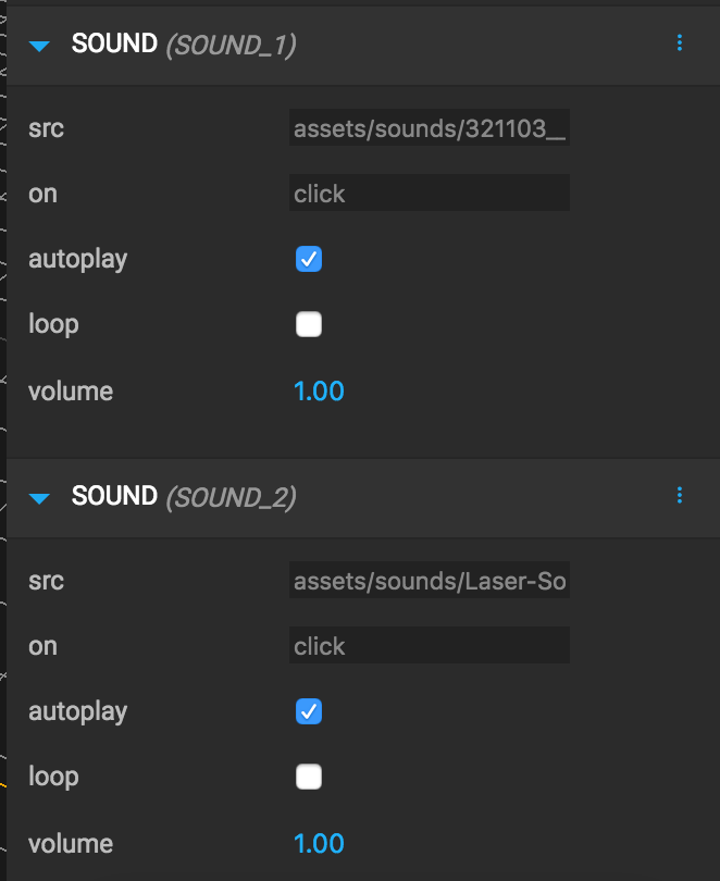
I'm afraid that showing the labels all the time won't fit in some situations, like when we've multiple components:
screenshot 2016-06-29 01 57 11

@dmarcos
Copy link
Member

dmarcos commented Jul 11, 2016

When having multiple components we can show the id in the panel like the html element (<a-entity>) in the common section

@fernandojsg
Copy link
Member Author

But could be nice to see them when everything is collapsed

@dmarcos
Copy link
Member

dmarcos commented Jul 11, 2016

What about always showing the attribute name as it is. Only SOUND__2 instead of SOUND (SOUND__2) ?

@fernandojsg
Copy link
Member Author

We had already an issue on the previous repo but I deleted when I changed the repos, I've created a new one to discuss it again -> #190

@ngokevin
Copy link
Member

ngokevin commented Jul 11, 2016

Use text-overflow: ellipsis + max-width up until the start of the icons so they don't clash. Then use title so they can see the full name on hover.

SOMESUPERLONGCOMPONENT__TRUNC... icon1 icon2

@fernandojsg
Copy link
Member Author

@ngokevin ok thank you! And what do you think about the icons + tooltip/label? #10

@ngokevin
Copy link
Member

The current state is great. Only problems:

  • Tooltip takes too long to display on Chrome after hover. We can't really change that except by using a custom solution.
  • Eraser icon might not be immediately clear what it does. The alert modal does help. Personally, I don't think we need Reset to Default and would remove it (Trashing + Re-add would do it too). But if we keep it, we'll have telemetry to see how often it is used.

Addressing those two might not be in context of this PR.

@dmarcos
Copy link
Member

dmarcos commented Jul 11, 2016

What about using labels instead of icons? text labels with a background + underline to convey clickability ( remove, delete )

@ngokevin
Copy link
Member

That sounds good, it would solve both issues.

@fernandojsg
Copy link
Member Author

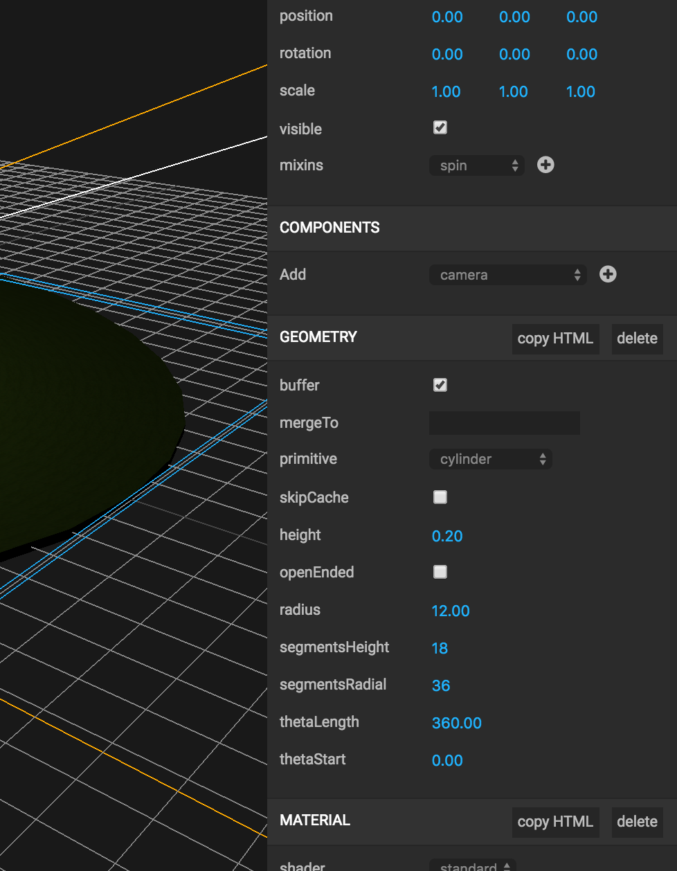
Something like this?
screenshot 2016-07-12 00 30 49
I also start to believe that the clear button probably won't be used so much, so we could remove it and just add it in the future if someone asks for it. Or just leave it on the edit menu, just in case :)

@ngokevin
Copy link
Member

That looks good. Maybe lowercase copy html too.

@fernandojsg fernandojsg force-pushed the component_icons branch 3 times, most recently from 78a8f74 to 7c1ecd9 Compare July 11, 2016 23:02
@fernandojsg
Copy link
Member Author

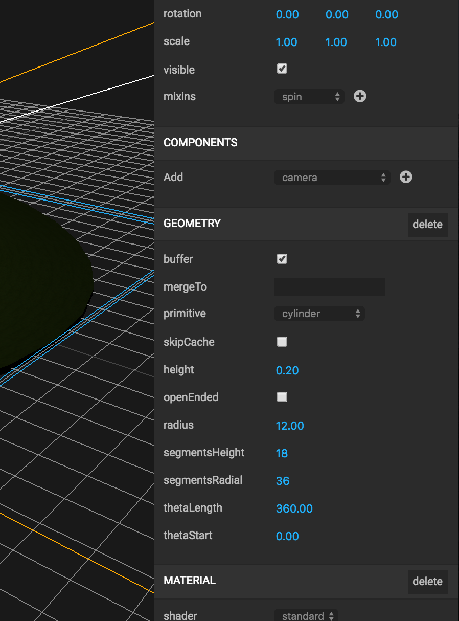
I've removed the reset to default button and the copy html because it was just to show the mockup and I'll open another PR with that functionality.
screenshot 2016-07-12 00 57 28

@ngokevin ngokevin removed the question label Jul 11, 2016
<a href='#' className='disabled'>Copy to clipboard</a>
</div>
<div>
<a href="#" title="Delete component" className="flat-button"
Copy link
Member

Choose a reason for hiding this comment

The reason will be displayed to describe this comment to others. Learn more.

single quotes

@ngokevin
Copy link
Member

remove component is more consistent to the API than delete. Former means to detach from the entity, latter almost sounds like to permanently delete.

r+wc love it

@fernandojsg
Copy link
Member Author

@ngokevin both changes done! thank you

@fernandojsg fernandojsg merged commit ed637c6 into aframevr:master Jul 11, 2016
@fernandojsg fernandojsg deleted the component_icons branch February 13, 2017 08:31
Sign up for free to join this conversation on GitHub. Already have an account? Sign in to comment

3 participants